Reading the chart (continued)
-
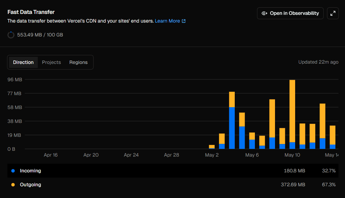
Peak on May 10 — the highest sustained traffic day in the graph. Both incoming and outgoing transfer increase here, which usually indicates a mix of:
- page loads (HTML + JS bundles)
- API calls (JSON responses)
- possible form submissions or user interactions
This kind of spike often happens when a post or project gets shared on social media or picked up by a small community.
-
Stabilization after the peak — after the spike, traffic settles into a consistent baseline. This usually represents:
- returning visitors
- cached page views
- regular API usage
The important takeaway is that incoming traffic spikes usually indicate user interactions, while outgoing spikes indicate page loads and content delivery.
What drives Fast Data Transfer usage?
Fast Data Transfer increases whenever Vercel serves data to users. The main contributors are:
1. Large pages and payloads
If your pages include large JavaScript bundles, heavy images, or large HTML payloads, every page view increases transfer.
2. Images and static assets
Even with CDN caching, every image, font, or video served contributes to outgoing bandwidth.
Unoptimized assets are the most common cause of unnecessary transfer growth.
3. API responses consumed by the browser
Any JSON returned from /api/* routes that is fetched client-side contributes directly to Fast Data Transfer.
Large or unpaginated API responses can quickly inflate usage.
4. High traffic pages
More users = more edge responses = more outgoing transfer.
Even lightweight pages scale linearly with traffic.
5. Lack of caching headers
If responses are not cached properly, users repeatedly download the same resources instead of using cached versions.
How to reduce Fast Data Transfer usage
If you want to optimize usage (or stay efficient at scale), here are the key strategies:
1. Optimize images (biggest win)
Use modern formats like WebP or AVIF and serve properly sized images.
Tools like Next.js next/image help automatically optimize and resize assets.
2. Enable long-term caching
Set cache headers for static assets:
Cache-Control: public, max-age=31536000, immutableThis ensures repeat visitors don’t re-download unchanged assets.
3. Reduce JavaScript bundle size
- Remove unused dependencies
- Use dynamic imports
- Avoid shipping large libraries unnecessarily
Smaller bundles = lower outgoing transfer per visit.
4. Paginate API responses
Instead of:
return allUsers;Use:
return users.slice(0, 20);or proper database pagination.
5. Avoid over-fetching on the client
Only request the data you actually need in the UI. Over-fetching increases bandwidth without improving UX.
Free tier limits
On Vercel’s Hobby plan, you get:
- 100 GB Fast Data Transfer per month
Compared to Fast Origin Transfer (10 GB), this is significantly more generous because it includes all user-facing bandwidth.
For most small to medium projects, this is more than enough unless:
- you serve large media files
- you have high traffic
- your pages are not optimized
Conclusion
Fast Data Transfer represents the user-facing bandwidth between Vercel’s edge network and your visitors.
To summarize:
- Incoming = users sending data to your site
- Outgoing = your site delivering content to users
- Most usage comes from:
- images
- JavaScript bundles
- API responses
- traffic volume
If Fast Origin Transfer is your internal server cost, Fast Data Transfer is your public delivery cost.
Optimizing assets, caching properly, and reducing payload sizes will almost always keep this metric comfortably within limits.